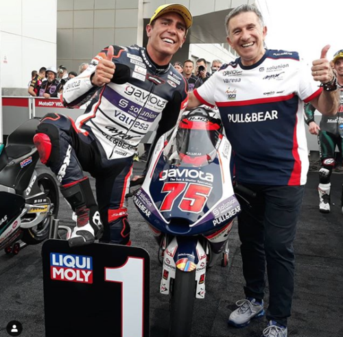
Ever wonder how a racing livery is created? How is it different than motorcycle production graphics/livery? How is it the same? And, how does it feel to have your work on a world championship winning team? Read on!
On my previous post about the story of my livery design career I explained how it started and went all the way to the pinnacle of motorcycle racing, MotoGP :)
Here I will explain my racing livery design approach, how is diferent than production livery design, what do they share, and how my design got to be the livery of the 2020 Moto 3 world championship Aspar team….., well, that’s easy: Albert Arenas X Aspar! The right combination AND time (They were also together in 2019) of rider/team, but “how does it feel?” it feels surreal!
As noted on my previous post, I worked with Aspar for their 2014-2015 MotoGP season. After that, I became very good friends with Gino Borsoi (Team Manager) and Majo Botella (Marketing). At the end of 2019, they came to me for livery design help for their 2020 season. They had tested some concepts but it just wasn't coming out up to part :(
Step 1 and main difference with racing to production livery design: For racing, is all about the main sponsor, for production, is all about the brand and the bike, HUGE difference!
So, the starting point is the sponsor logos layout.
Step 2: Once I have an initial (Subject to change!) layout for the logos, my goal (Which is something shared with production livery design) is to create a cool frame for the logos, THAT is THE main goal of a well done livery. Although there is nothing wrong with developing one’s own style, It is a must AND where the challenge lies, to create original work as per the client’s needs, so HERE is where I start looking for inspiration to design that “logos frame”. In the 2020 Aspar case, I looked at tennis shoes! and a bike rendering that caught my attention.
Step 3: Start working the first idea WITH the colors of the main sponsor, in this case, Gaviota.
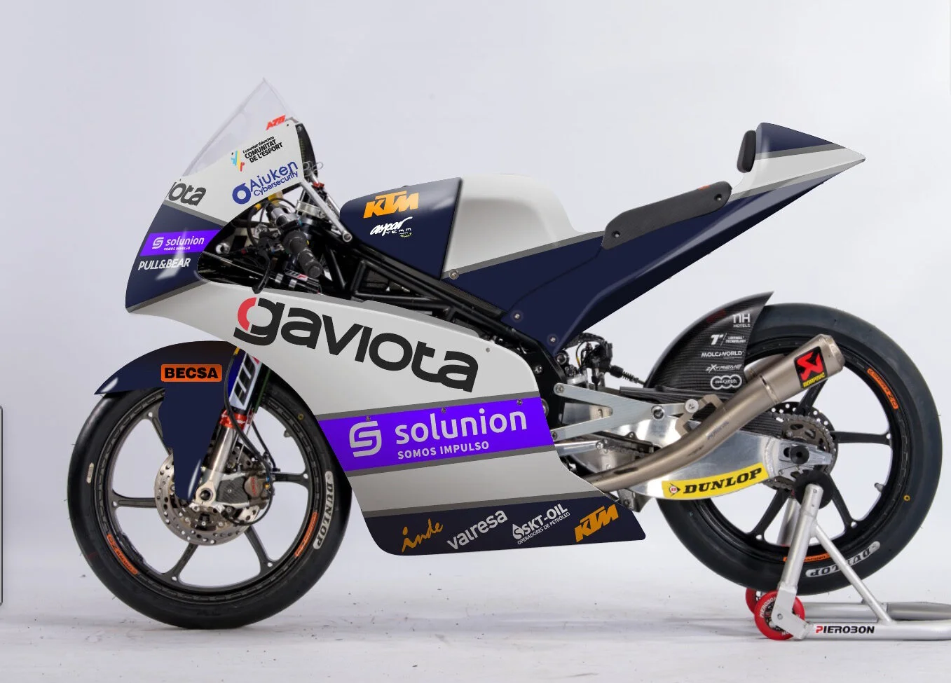
Although a cool concept already that we all liked, the team was not feeling the overlapping of the Gaviota logo, so…..back to the drawing board and working with all the comments of this first proposal…voila!
The 2nd proposal hit the nail on the head, but in this case, I used their Moto 2 as a template and this one with more of the tennis shoes inspiration.
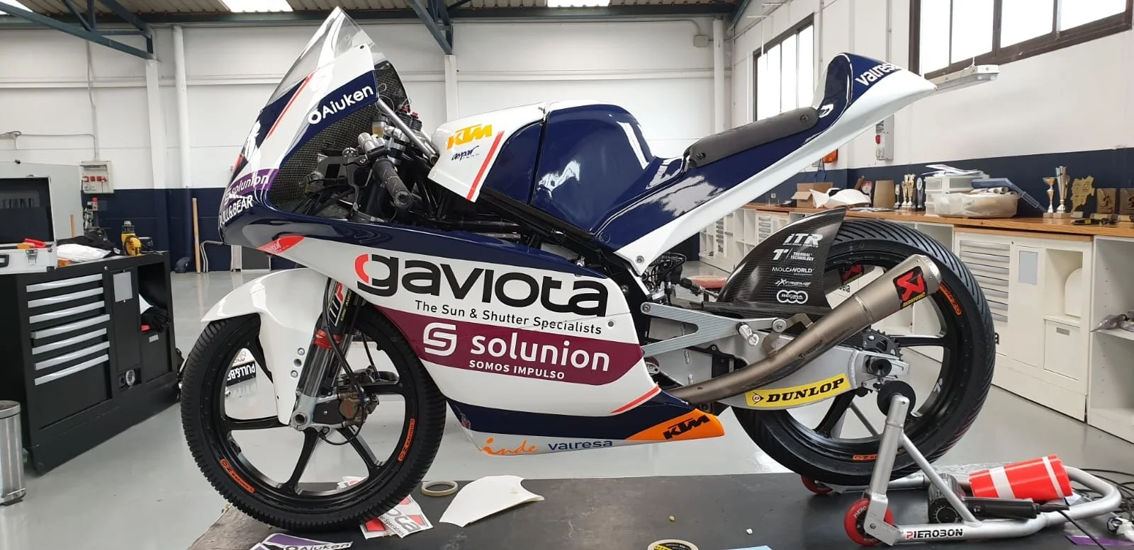
Step 4: The first real life mockups begun, notice the variation on the belly pan to accommodate another sponsor logo.
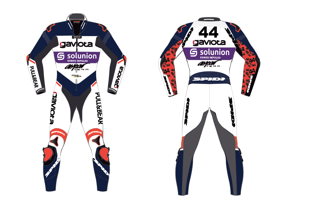
Once we have the bike’s livery approved, THIS is THE point of inspiration for the rest of the team’s assets, truck, box, team apparel, rider’s suit etc
All the work was done, ready for the 2020 season and then…COVID-19! However and thankfully, the Moto 2 and 3 teams were already in Qatar, so the first race of the season was possible (But without the GP teams) and….WE WON, WE WON!!! WOW!!!!!
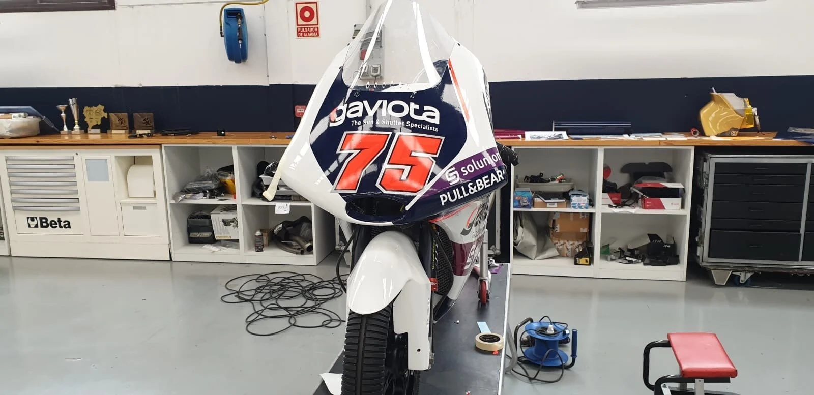
We were all specially proud how the front came out! LOVE LOVE!
Of course, this high was interrupted with the VERY low, a bunch of races cancelled and postponed due to COVID, but once the show went on later in the year, Albert x Aspar continued to win races and have enought top results to:
I was already in shock with the first race win, then more and more, then the whole championship looked very likely and at last! What a feeling and honor, SO SO thankful to Aspar and bravo Albert!
Which, Aspar will continue (as this is very often the case) with the same livery and VERY happy sponsors for 2021, but Albert steps up to Moto2, stay tuned!

